Theme
Customize the look of your customer-facing emails and checkouts — fonts, corner style, button style, and a brand colour palette generated automatically from your brand colour.
Written By Tobias Lønnerød Madsen
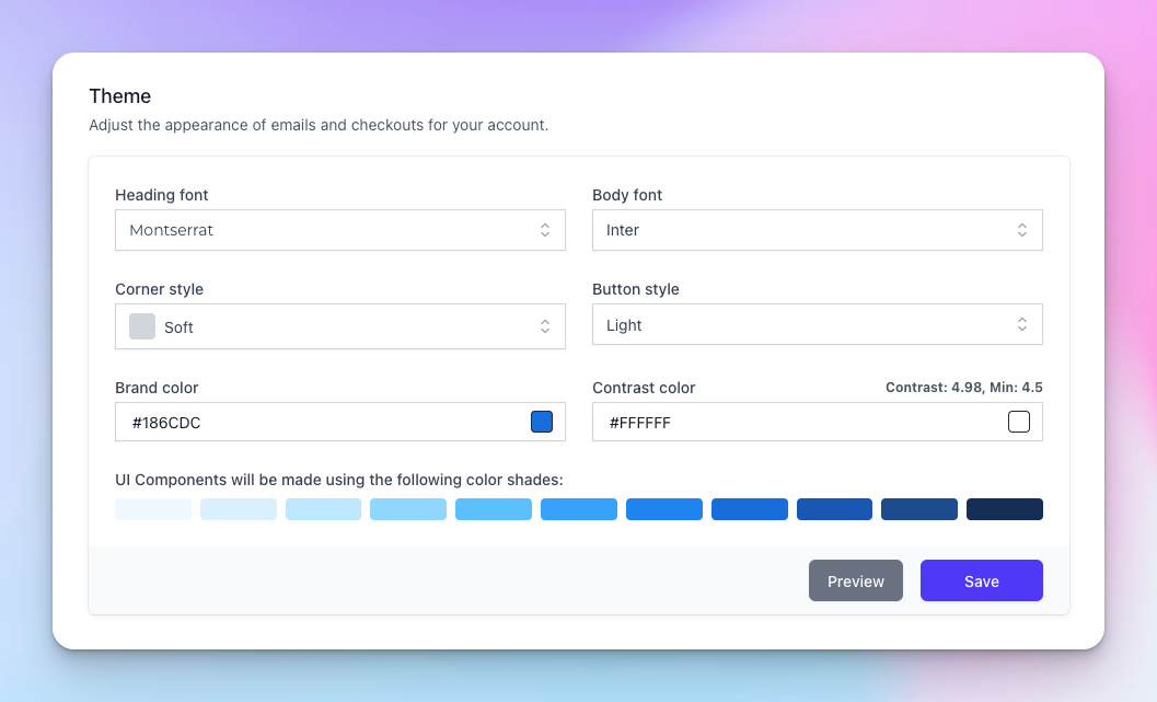
The theme controls how your customer-facing emails and checkouts look. The same theme applies to both, so anything you change here updates every email Moonbase sends on your behalf and every checkout your customers see.
Fonts
Pick a heading font and a body font. Headings can be a more decorative font (Poppins, PT Serif, EB Garamond, etc.); body should be something that reads well at small sizes (Inter and Roboto are safe defaults). Both fonts are loaded from Google Fonts so they render in any email client that supports webfonts and fall back gracefully where they don't.
Corner style
Three options control how rounded the corners of buttons, cards, and pills are throughout the theme:
Sharp — no corner radius. Most architectural feel.
Soft — small radius. Modern but restrained.
Round — fully rounded pills. Friendlier and more playful.
Button style
Light — solid filled buttons in your brand colour.
Outlined — transparent buttons with a coloured border. Use this if your emails or checkouts have busy backgrounds where solid buttons would clash.
Colours
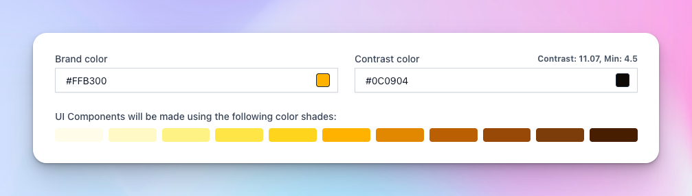
You only set two colours; the rest of the palette is generated.
Brand colour — your main brand identity colour. Used on buttons, headings, and accents. Pick the same colour you use elsewhere on your site.
Contrast colour — used for text on top of your brand colour (typically black or white). Moonbase shows the contrast ratio next to this field; aim for at least 4.5 (WCAG AA). Anything below shows a red warning. If you change the brand colour, we automatically pick a contrast colour that hits the threshold, but you can override it.
The eleven-shade palette below the colours preview is auto-generated from your brand colour and is what every UI component actually uses (lighter shades for backgrounds, darker for text and borders). You don't pick these directly.
Previewing changes
The Preview button opens a modal with a sample email and checkout rendered in your current settings — make use of it before saving so you can see how text legibility, button styles, and colour combinations look together. The preview reflects unsaved changes.